Acquisition
Explain the product quickly and give new users a clear path toward trying or downloading it.
EDTECH · PRODUCT DESIGN
Soundedify is a music-learning product concept designed as a connected ecosystem — from the public website and editorial content to the learner dashboard, lesson experience, progress tracking and admin workspace.

Learning, progress and administration in one coherent product language.
01 / THE CHALLENGE
The project grew beyond a landing page into a broader product ecosystem. The challenge was to keep very different contexts — marketing, learning, progress and administration — feeling related without forcing them into the same layout.
The shared goal was clarity: help a beginner understand the product, help a learner know what to do next, and help an administrator understand what is happening across the platform.
Explain the product quickly and give new users a clear path toward trying or downloading it.
Make lessons, progress and next actions visible without turning the dashboard into a wall of data.
Give administrators a separate workspace for users, subscriptions, activity and revenue-oriented metrics.
02 / VISUAL DIRECTION
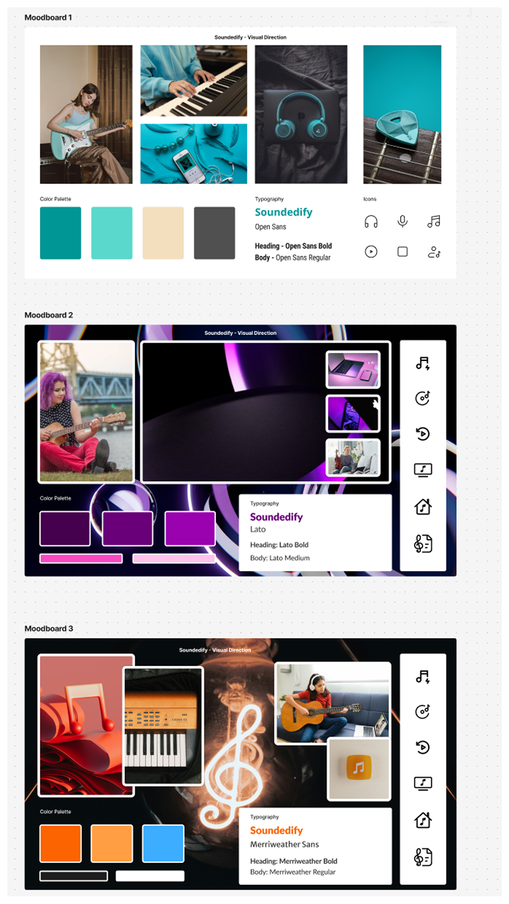
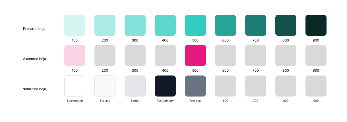
Early moodboards explored different visual directions for a modern music-learning service. The selected direction developed into a teal-led interface with a broad neutral range and brighter semantic accents for status, progress and achievement states.
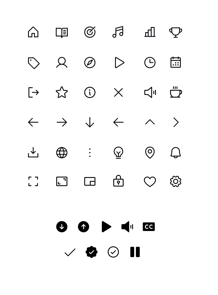
Typography, iconography and reusable dashboard patterns were defined so the same product language could work across marketing pages and application interfaces.
03 / PUBLIC EXPERIENCE
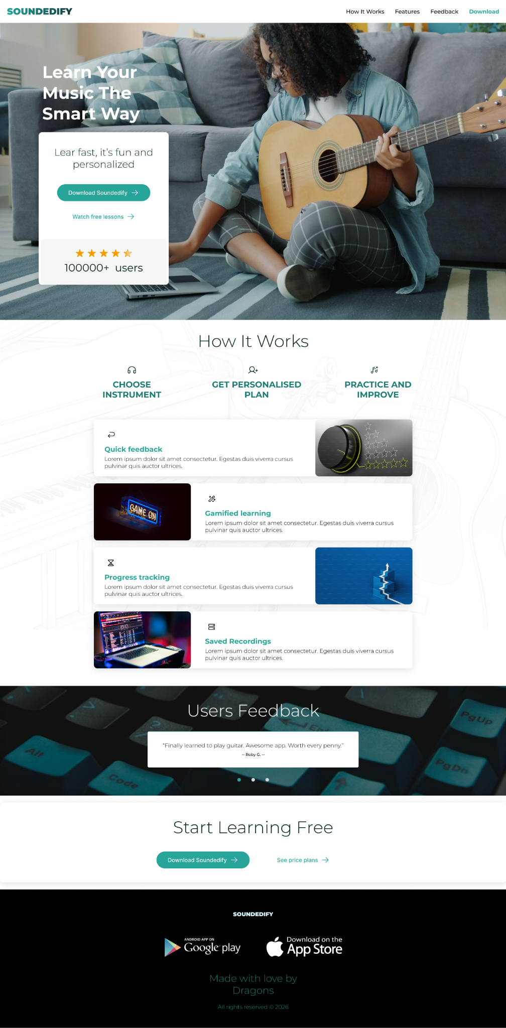
The public website introduces Soundedify through a simple value proposition, a three-step explanation of how it works, feature highlights, social proof and repeated calls to action.
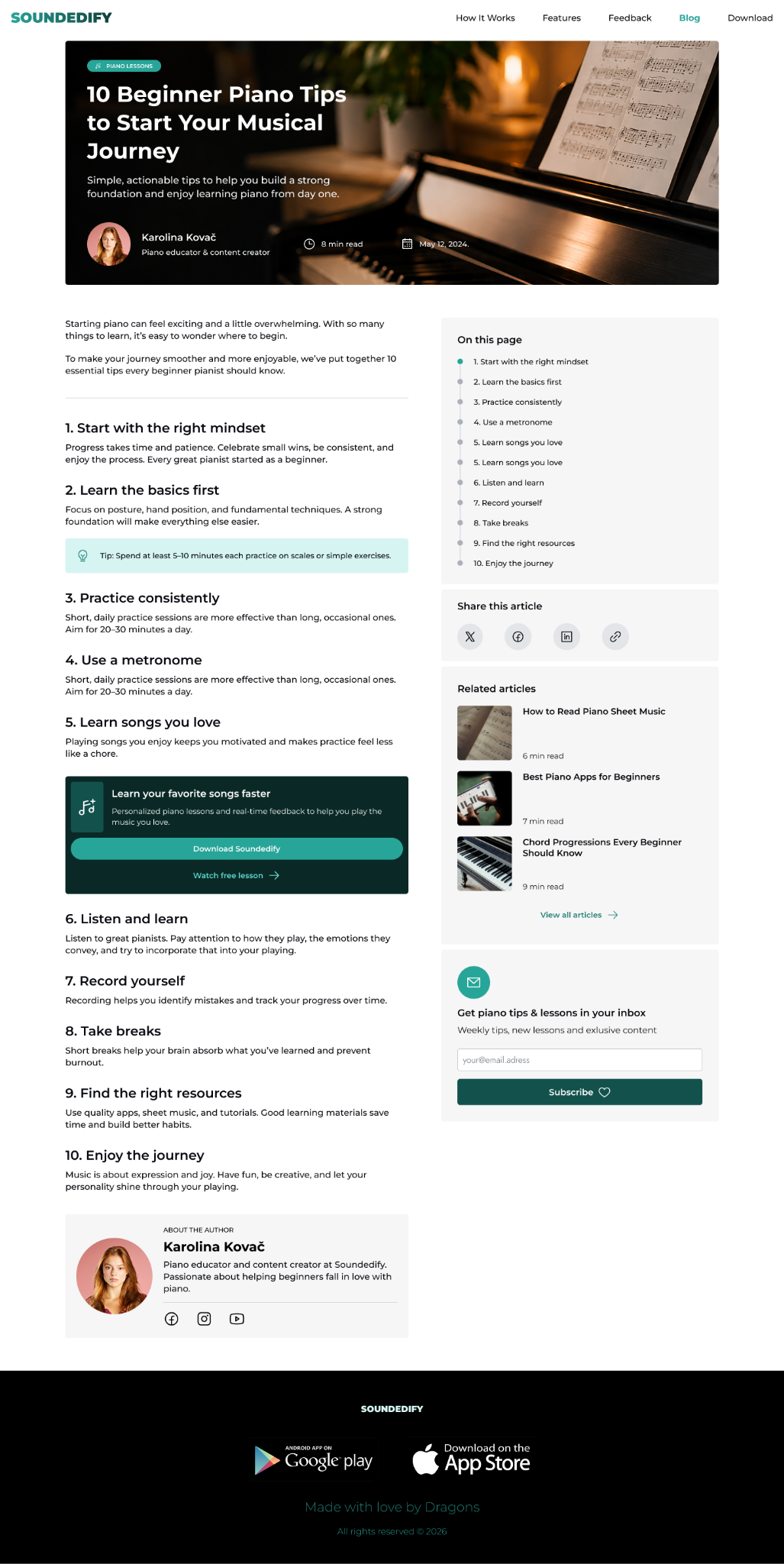
Responsive layouts adapt the same content model to narrower screens while preserving the hierarchy. An editorial article template extends the product into useful educational content and supports discoverability beyond the main landing page.


04 / LEARNER EXPERIENCE
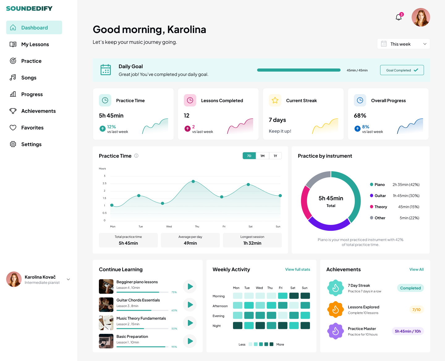
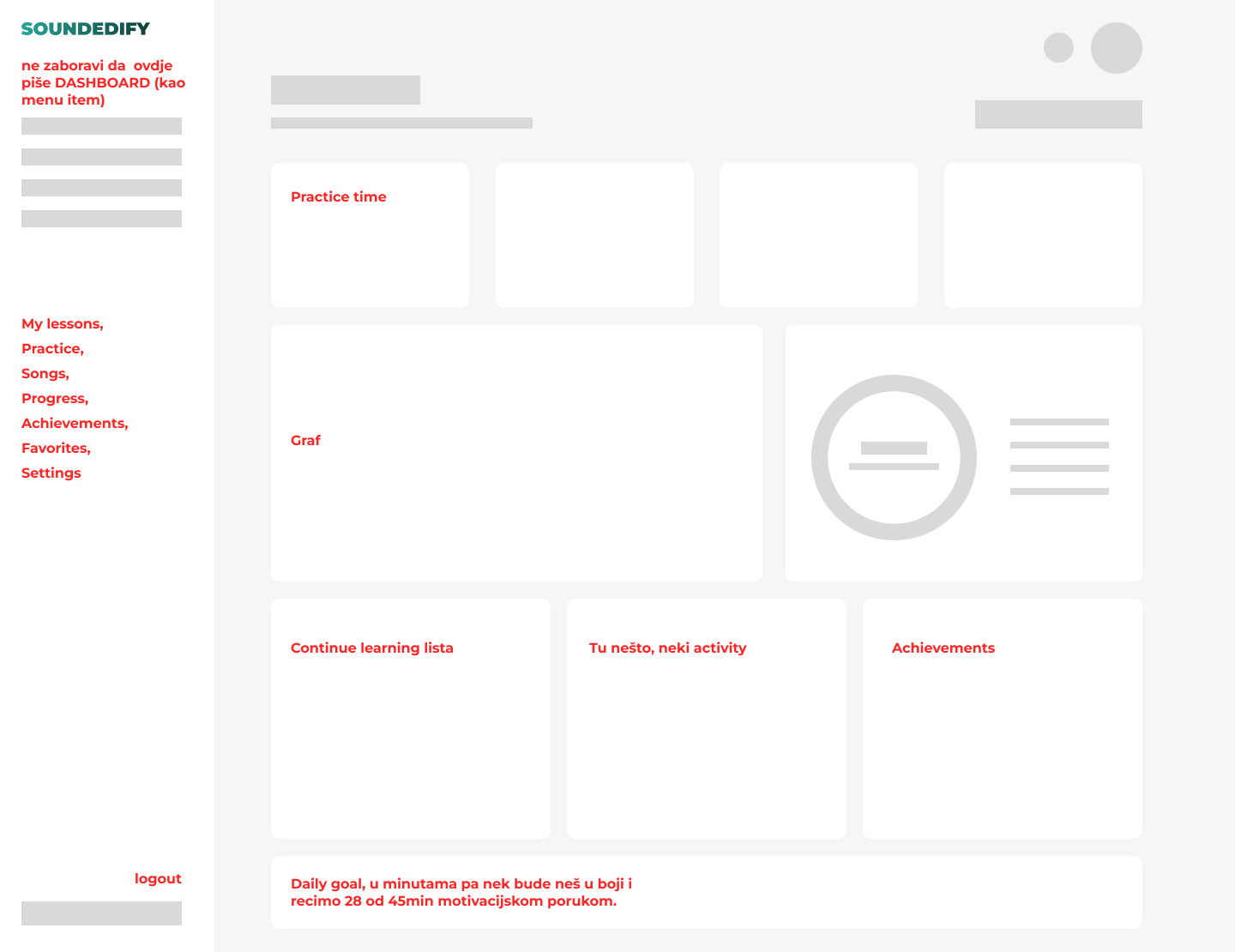
The learner dashboard brings together daily goals, practice time, completed lessons, streaks, overall progress and instrument-level activity. A rough structural sketch was used first to determine what deserved priority before the interface was refined.
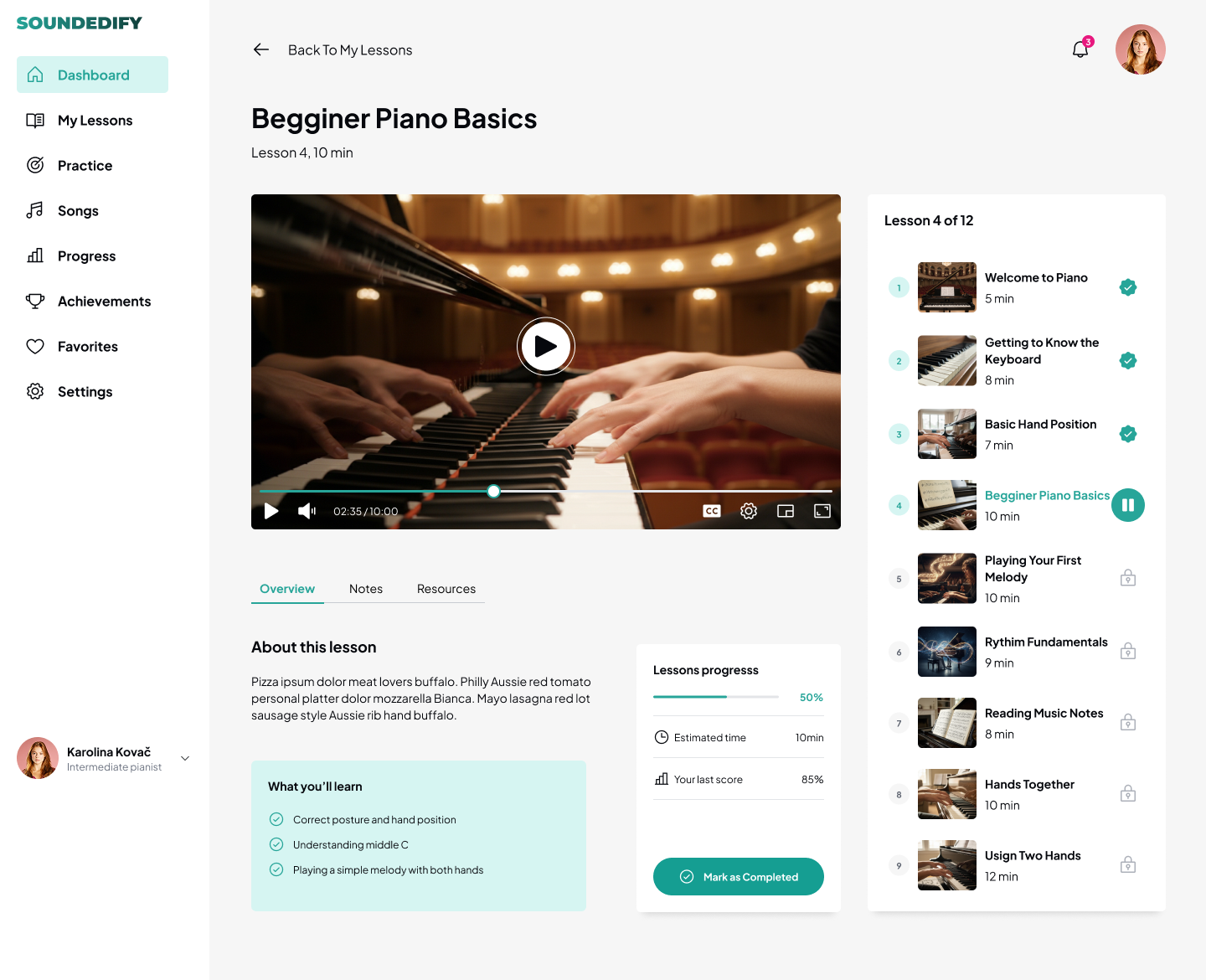
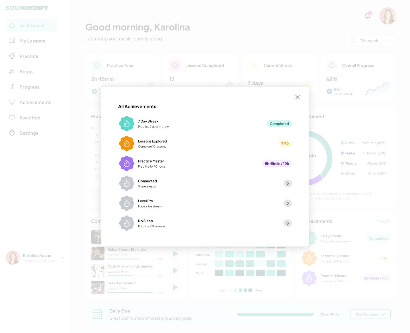
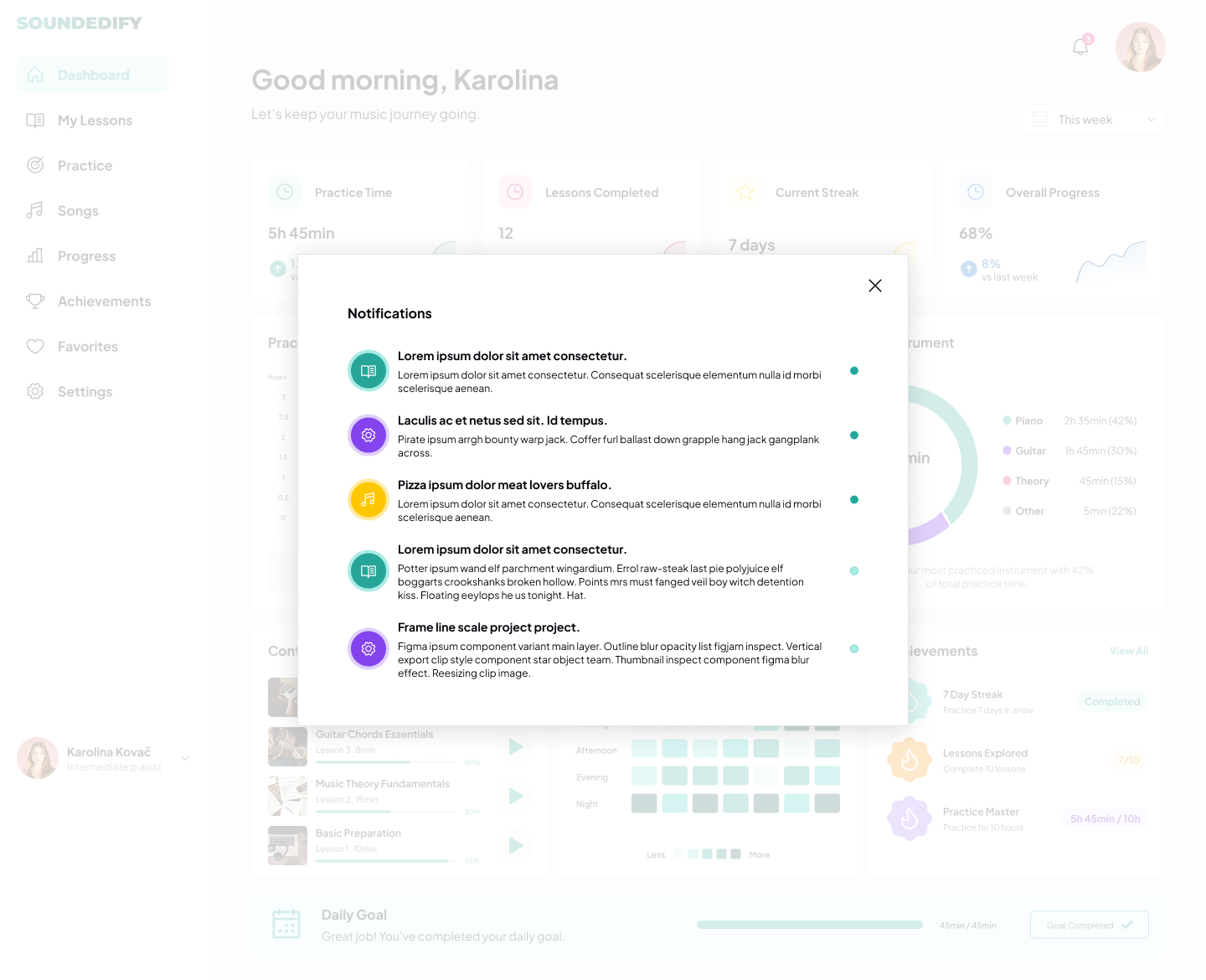
Supporting views extend the system into a lesson player, achievements and notifications without breaking the overall dashboard model.
05 / ADMIN WORKSPACE
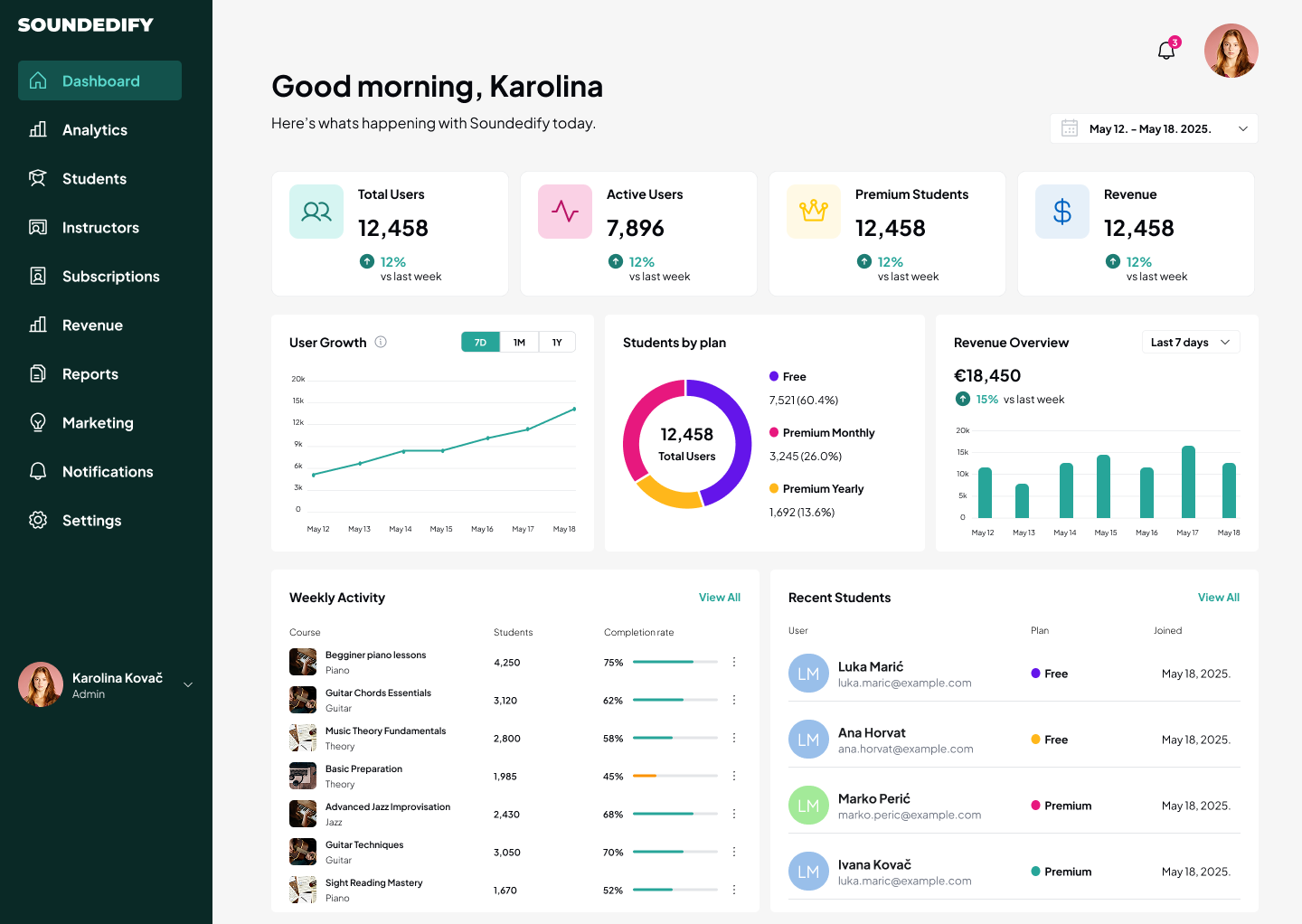
The admin side uses the same visual foundations but shifts the hierarchy toward operational information: users, active usage, premium plans, revenue, course activity and recent students.
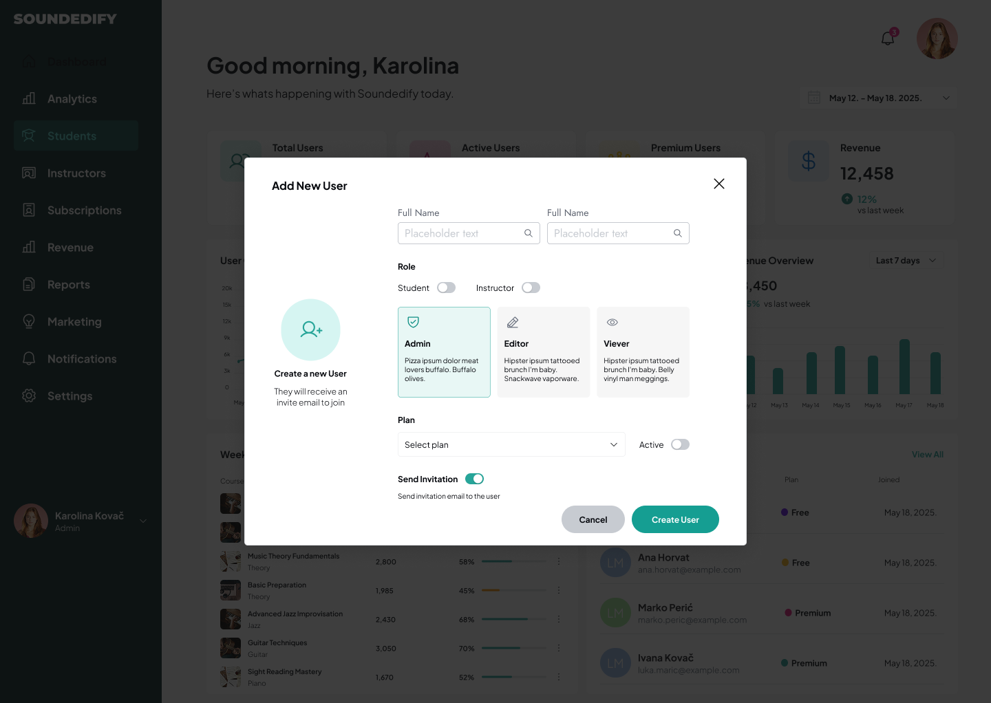
Administrative actions such as creating a user introduce role selection, plan assignment, account state and invitation controls inside a focused modal rather than overloading the dashboard itself.
06 / CAMPAIGN CONTENT
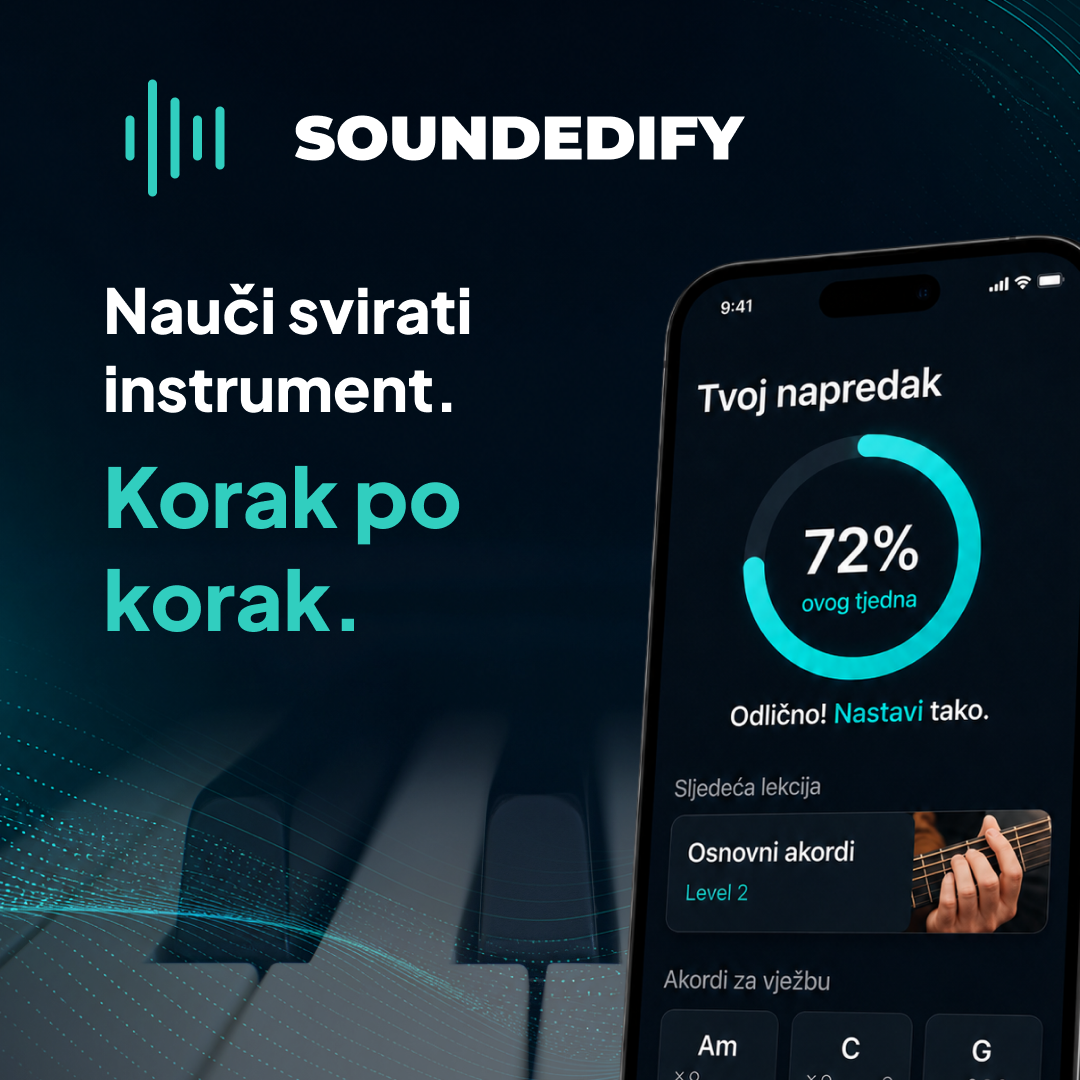
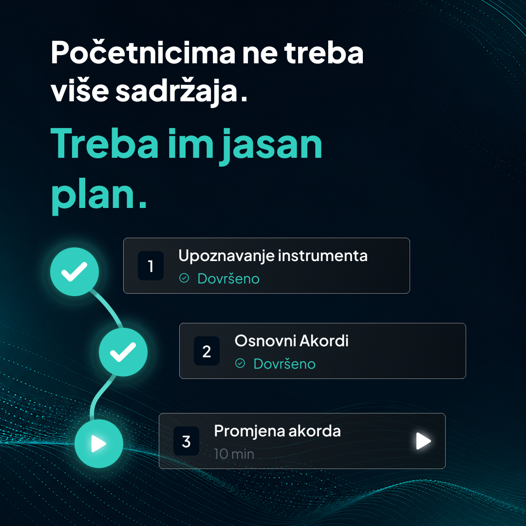
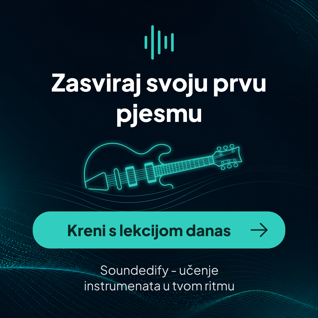
The visual language was extended into a short social carousel aimed at beginners. It communicates progress, guided learning and a clear call to action while keeping the dark product mood and turquoise accent recognizable.
This part of the project helped test whether the identity could remain consistent in promotional content, not only inside screens.
07 / REFLECTION
Soundedify brought together multiple kinds of interface work in one concept: responsive marketing, editorial content, learner tools, data-rich dashboards, modal flows and administration.
If the product were taken further, the next step would be usability testing across the two core roles — learner and administrator — with special attention to dashboard prioritization, lesson continuation and the amount of information shown at once.
The learner and administrator use the same product but need very different information and actions.
Typography, color, icons and recurring components create continuity across public and authenticated experiences.
The project covers wide dashboards, editorial pages and narrow marketing layouts rather than one fixed canvas.
ABOUT THE DESIGNER
UX/UI and visual designer focused on clear digital experiences, interface systems and practical design solutions across web, mobile and presentation work.
View selected work