Positive by default
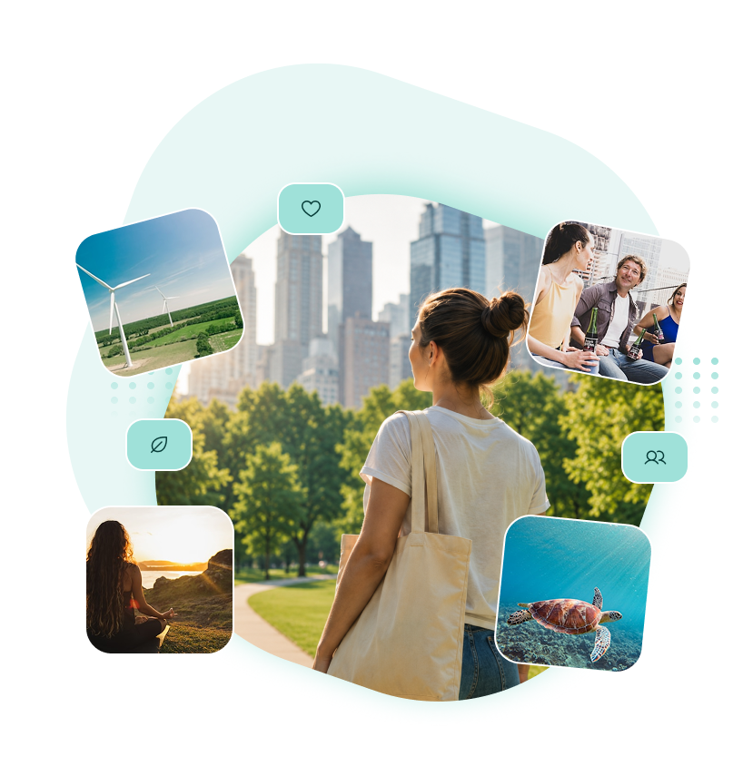
Lead with constructive stories and an optimistic visual tone without turning the interface into decoration.
MOBILE PRODUCT DESIGN
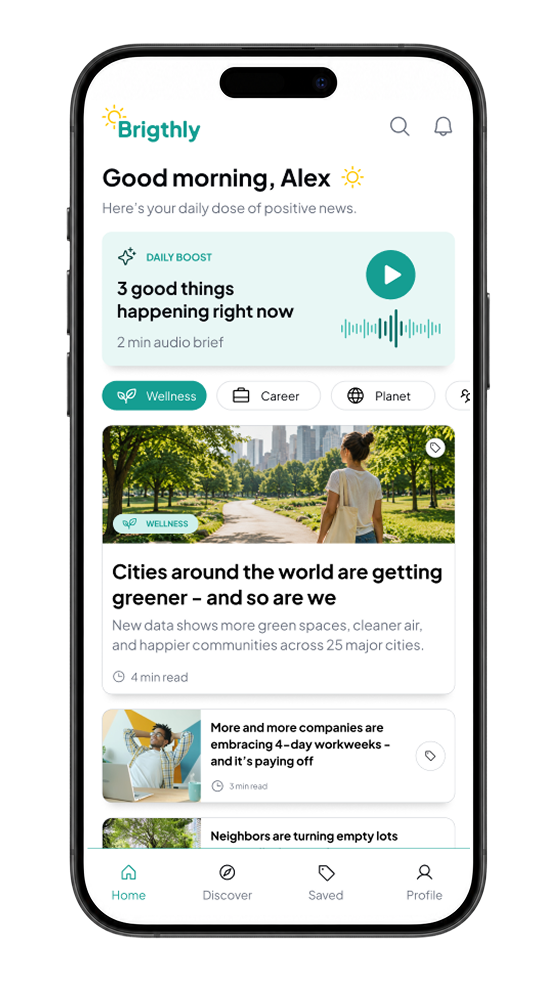
Brightly is a mobile news concept designed around positive, useful stories — with a lightweight onboarding flow, personalized interests, saved content and a simple premium subscription path.

Positive news, shaped around what matters to you.
01 / THE CHALLENGE
The concept started with a simple product question: how can a news experience feel informative and relevant without becoming visually heavy or emotionally exhausting?
Brightly focuses the experience on clear hierarchy, positive framing and user-controlled interests, while keeping familiar news patterns such as feeds, saved stories and article reading.
Lead with constructive stories and an optimistic visual tone without turning the interface into decoration.
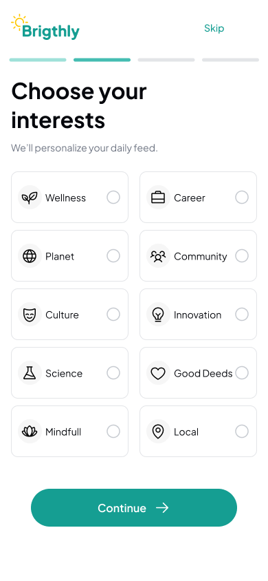
Let people choose the topics they care about before they enter the main feed.
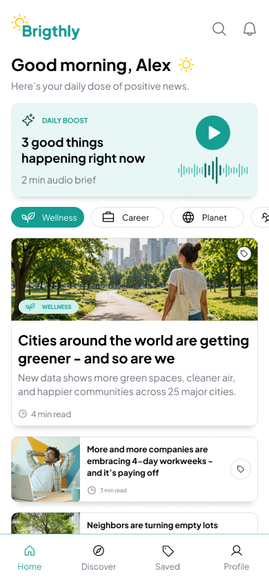
Use a restrained system of cards, tags and typography so the stories remain the primary focus.
02 / STRUCTURE & FLOW
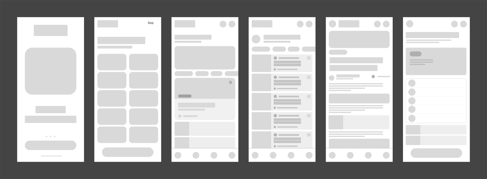
I mapped the core journey around the moments needed for a complete first version of the product: introduction, interest selection, personalized feed, saved content, article reading and subscription.
The early wireframes helped establish information hierarchy before moving into high-fidelity interface decisions.
03 / VISUAL SYSTEM
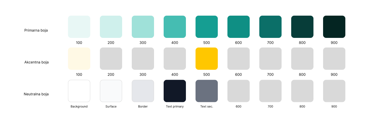
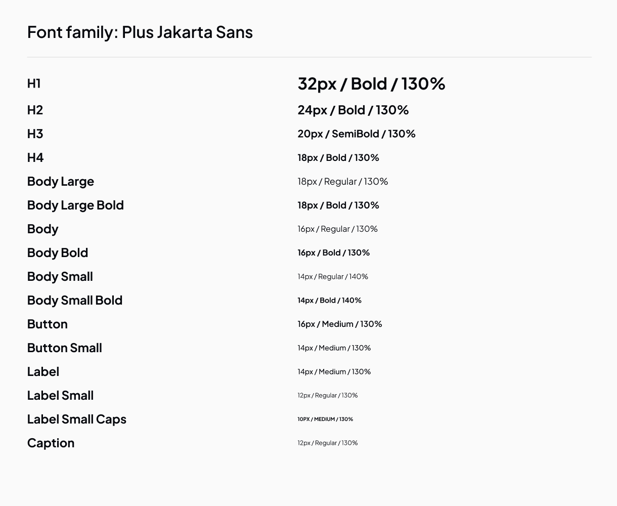
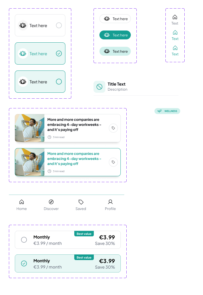
The interface uses a compact visual system built around teal, warm yellow and soft neutral tones. Plus Jakarta Sans supports a modern, friendly feel while keeping longer reading content clear.
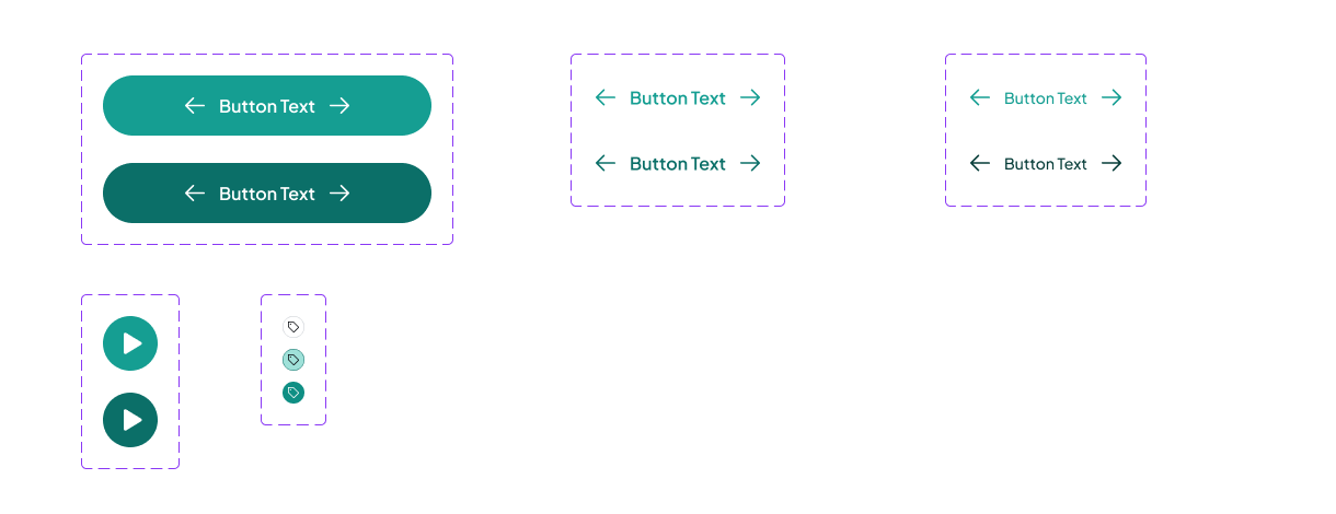
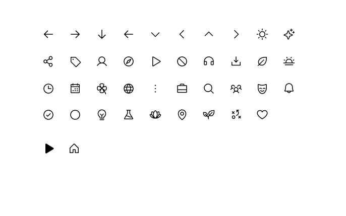
Buttons, article cards, navigation and small status patterns were treated as reusable components to keep the product consistent across different screens.
04 / CORE EXPERIENCE
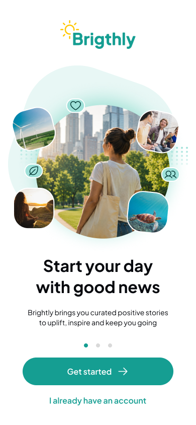
The onboarding flow introduces the product quickly and asks for only one meaningful decision before the main experience: choosing interests.
That keeps the first-use flow lightweight while giving the home screen an immediate reason to feel personal.
05 / READING & RETURNING
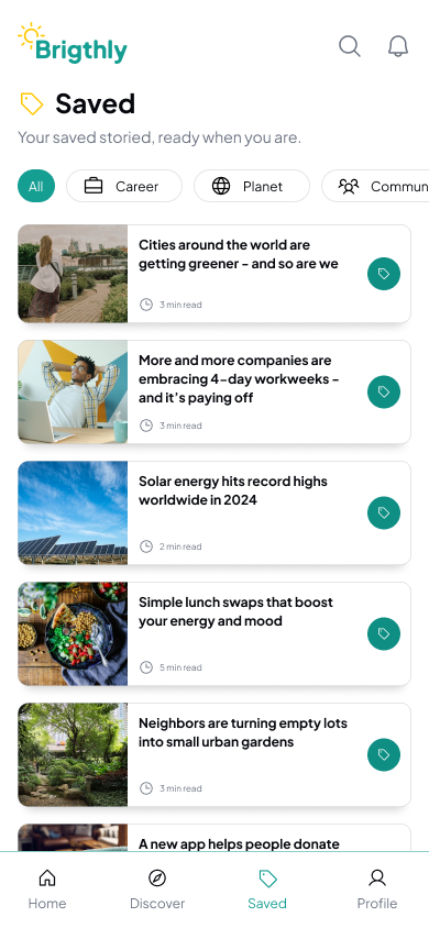
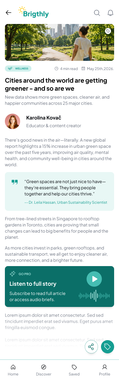
Beyond the feed, the product gives users two reasons to return: saved stories and a focused article-reading experience.
Both screens reuse the same tags, spacing, typography and navigation patterns so the app feels familiar as the content depth increases.
06 / SUBSCRIPTION
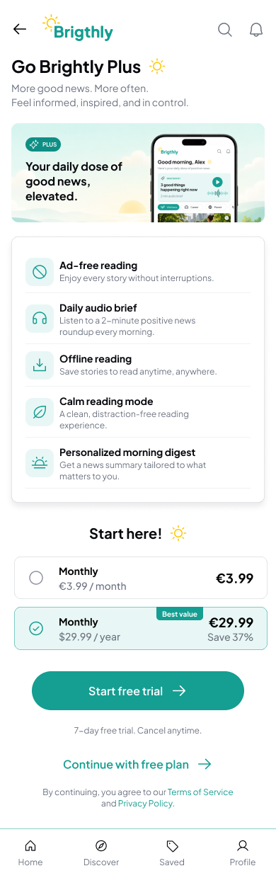
The premium screen brings the subscription offer into the same visual language as the rest of the product: clear benefits, simple plan comparison and one primary call to action.
The goal was to make monetization feel like a natural extension of the product rather than a separate sales experience.
GO BRIGHTLY PLUS
07 / REFLECTION
Brightly combines several product-design layers in one compact mobile concept: onboarding, personalization, content hierarchy, reusable components, long-form reading and monetization.
If developed further, the next step would be validating how many interest choices users are comfortable making, which positive-news categories feel most relevant and when a premium offer should appear in the journey.
Wireframes established the core flow and content hierarchy before visual refinement.
Reusable patterns make the interface feel consistent across browsing, reading and subscription.
The case study considers acquisition, daily use, return behavior and monetization as one connected experience.
ABOUT THE DESIGNER
UX/UI and visual designer focused on clear digital experiences, interface systems and practical design solutions across web, mobile and presentation work.
View selected work